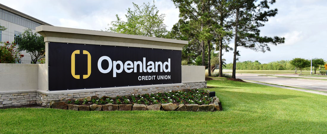
You may have seen something new driving down Broadway in Pearland this week. Among the familiar signs stands a pop of vivid yellow and the word “Openland” prominently displayed; refusing to blend into the background. What once quietly represented a steadfast foundation in The Associated Credit Union of Texas, now boldly proclaims how the organization is positioning itself to better represent its neighbors in a growing and changing community.
For decades ACU of Texas built their reputation through local partnerships, community involvement, and support for area businesses, schools, and organizations. “Over seventy-five years in business, I think we really established ourselves as a trusted partner for our members,” said Marketing Communications Specialist Rachel Parker. Over time, though, leadership realized that the name that had carried them for generations was no longer keeping up with who they had become.
“The credit union’s membership and market had grown to the point that we did not think it told our story very well anymore.” As Parker explained it, the organization started asking basic but important questions about their identity and how they represented who they are and who they represent. Those questions led to a full rebranding process over a period of eighteen months in preparation for a new launch.
The timing, according to Business Development Officer Noel Noble, has everything to do with the world their members live in today. “We are in different times,” she said. “The lens is very much different from 75 years ago.” To her, a modern financial institution that wants to be taken seriously as a community partner has to show that it sees the people who are here now, living side by side and doing life together.
“In terms of community, we are all kind of living in the same spaces and doing the same things,” Noble said. “But to be seen as an organization that really encompasses what community is and where we are trekking now, is really the trajectory of where we want to be to move forward and branch out.” The new name is part of that trajectory, a way of aligning how the credit union looks and sounds from the outside with the way it has already been serving from the inside.
What is Openland?
This is much more than just a fresh coat of paint. It is built around a simple but strong visual. “Our logo is a doorway,” Parker said. “The idea is that the logo represents endless possibilities. Whatever opportunities our members are looking for, we want to help you find more of what matters.”
Noble likes how the design and the name work together. “The graphic brackets in the logo are intentionally open,” she said, “signaling that there is space for more and tying directly into the name Openland. It has something kind of infectious to bring you into the community where we live.” She said even the color change is part of that invitation. Members and neighbors who drive by notice it immediately, and that reaction is by design. Noble has seen it first hand: “one day you see ACU of Texas on the sign, the next day you see Openland and people ask, “What is that? Is that new?”
Clearer Voice, Same Values and Relationships
The first reaction from outside the credit union was predictable. “I think people outside first asked: Were you acquired? Was this a merger?” Parker noted. “You see a name change and wonder what happened.” The answer from Openland’s team is simple. “Nothing’s changed. We are still the same people and our mission is still the same.”
“We have established more what our values are and how we want to move forward with that. But we are not for sale. We are still a credit union here for you locally,” Parker said.
Members also wanted to know what it meant for their day-to-day banking. The credit union has been clear that debit cards do not have to be replaced immediately, accounts continue to function, online access still works, and very little changes operationally. The rebrand is primarily about focus and direction.
Parker said long-time members initially expressed concerns about whether fee structures or account terms might change. But once staff explained their intent, the response has been “overwhelmingly positive.”
From a business development standpoint, the new look has created something every marketer hopes for: curiosity. “The color change, the shock and awe of it all, is intriguing,” Noble said. “It draws people in and invites them to step into the space of Openland in a way the old brand never did.”
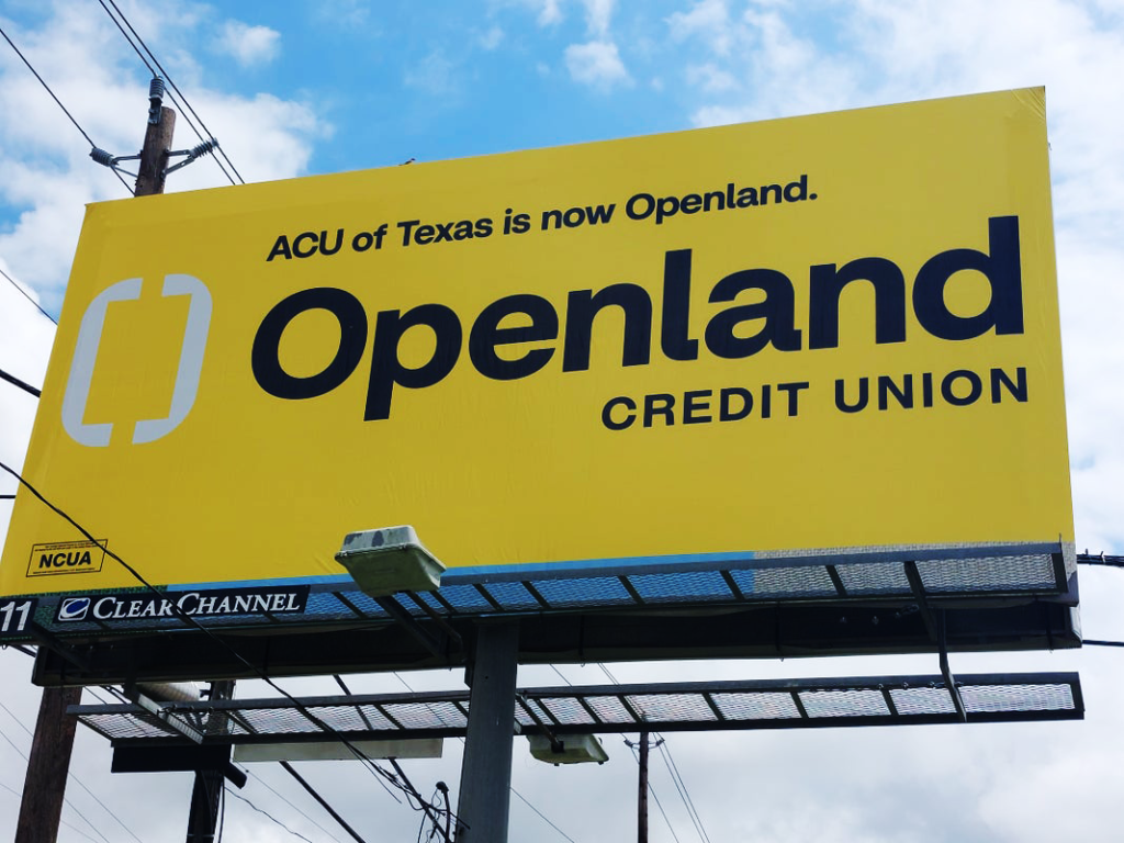
Some people assumed Openland was a brand new institution because they didn’t realize it was the same credit union they had known for years. Others who were already familiar with ACU of Texas took the rebrand as a signal. “Others that knew were just like, okay, we see you now,” Noble said. The updated colors are part of that presence. “They are kind of engaging… They speak to one another, and they kind of grab you.”
That visual shift aligns with how Noble wants people to experience the institution itself. “Although we were all of these things before, we were very member focused and still are,” she said. “But now you want to know who we are.” The signage can get people in the door. The relationship work starts once they walk through it.
Openland Community
Openland Credit Union serves a 21-county field of membership and is open to anyone who lives, works or worships within that footprint. “Big picture?” Parker added, “our credit union aims to be a partner to members at every stage of life, whether they are saving for retirement, planning for their children’s education or simply trying to manage the next six months of family finances. We are really a credit union for people who want more.”
Noble sees that focus play out in how their products and offerings are structured. “Our solutions are definitely geared towards every possible member,” she said. “Your needs are not the same as the next person’s, and we are specifically looking to identify and support what your needs are to make life easier and better for you.”
“There is indeed an opening and a space for you,” Noble added. That philosophy shows up in programs like Openland’s preferred partner program for small businesses, which allows local companies to be listed on the credit union’s website so members can find trusted local providers and finance through Openland.
Keeping “Credit Union” in the Name
One trend in recent years has been for credit unions to swap “credit union” for “financial” in their names, often in an effort to appeal to a broader market and move away from their origins serving employee groups and local communities. Openland’s leadership made a different choice intentionally.
Parker shared that during the rebranding process, their CEO emphasized keeping the phrase “credit union” was non-negotiable because it is more than just a legal category. It is a reminder that the entire model is built on people helping people. He wanted to keep that history visible in the name and continue it forward, even as the brand itself evolved.
That decision also ties back to the organization’s not-for-profit structure. Noble framed it in terms of mutual benefit. “We have their best interests at heart,” she said of members. That reality gives Openland room to ask different questions when it meets potential members in the community.
Meeting Pearland’s Growth with Presence
Nowhere is the need for that presence more obvious than in Pearland, where population growth continues to reshape daily life. Openland has already invested in three local locations: a branch inside the H E B off 288, a Pearland office across from the Pearland Chamber of Commerce, and the Pearland-Friendswood location at Dixie Farm and 518. “Pearland is very, very important to the organization,” Noble said. “Clearly with three branches being available to the members, that lets us know that there is growth and that we have to be tapped into what that looks like and be ready for it.”
One concrete step has been the creation of Noble’s own role. “What we have done is incorporated the business development position to allow us to be out in the community more in different sectors,” she said. Her job is to make sure people know Openland is here, to listen for specific needs and to connect those needs with practical solutions.
Open Invitation
Rebranding an institution with 75 years of history is a challenge and care had to be taken to get it right. “It is a statement about who you have been, who you are now, and who you intend to become alongside the people you serve,” Parker concluded.
“This rebrand allows the opportunity to set us apart from the norm,” Noble added. “Keeping up with the times is important to be able to relate to where we are and prepare for a vibrant future, and I think Openland does that better than most.”For Openland Credit Union, the new name and doorway logo are a public way of saying that there is room for more stories, more goals, and more neighbors at the table. In other words, the door is open and there is plenty of room inside for whatever comes next.
Learn more and position yourself for a more prosperous future at: https://www.openlandcu.com